Thursday, October 31, 2013


Tim Burton is a very well known film director, artist, and animator known for his work. His quirky, dark, fantasy like aesthetic is highly recognizable around the world.  In addition to the countless movies that he's directed, he has now added playing cards. The packaging on the box is in his signature red and black colors with vertical stripes and skulls. Traditional playing cards come with 16 face cards- an ace, king, queen, and jack. These cards still come with face cards, however instead of a drawing of a typical queen or king,  it is an original drawing by Tim Burton. The characters are not drawn to represent their card- meaning the king does not look like a traditional king. The type used to represent the suit and number is also burton-esque. Written in black, thin, ink-like type
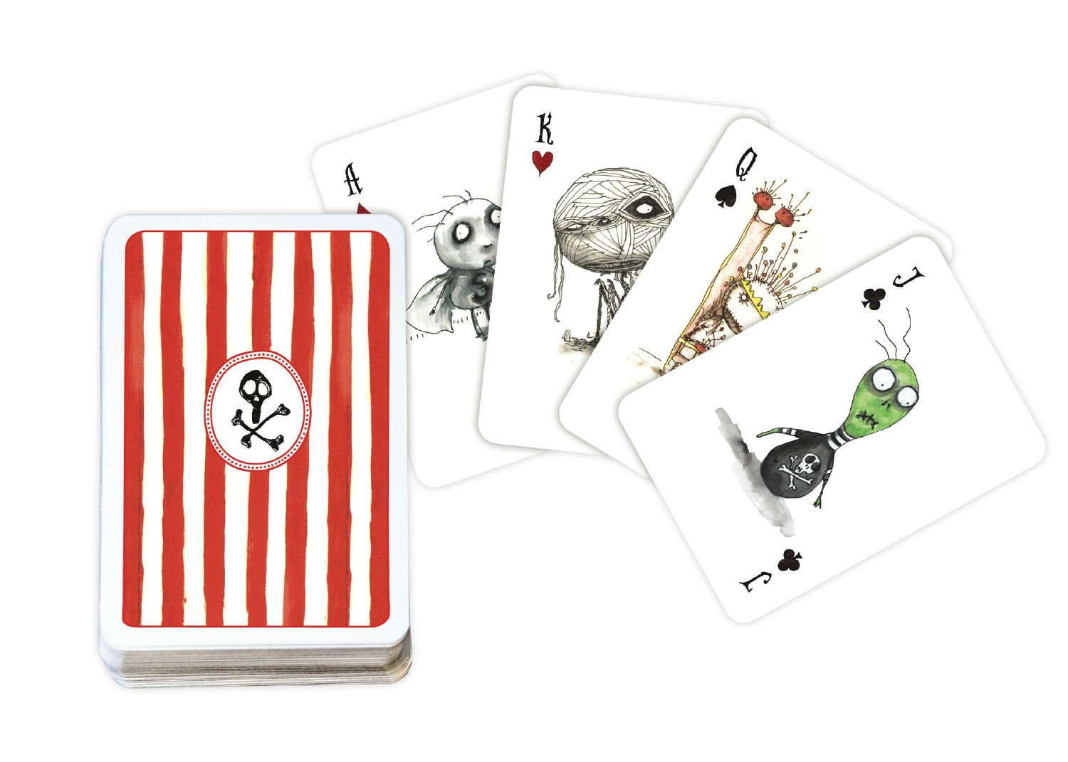
The backs of each card are decorated the same as the box- In a red and white vertical stripe and a skull and crossbow in the middle

Burton is well known for taking morbid curiosity and making it relate-able to all audiences. Movies such as Beetlejuice, Edward scissorhands, and nightmare before Christmas are just a select few of how diverse his moves are, yet still incorporate that macabre aesthetic.

Monday, October 28, 2013

I recently bought a new flat iron from Paul Mitchell collection. Normally their Ion classic iron comes in black but I bought a special "de-luxe" edition. Paul Mitchell is an american hair stylist who created his own brand of hair care products and tools. His legacy has built a reputation for making some of the best hair products on the market


The original iron comes in a black box decorated in accents of green and a barely visible print all over. The iron itself comes in a sleek black color with an all black cord


The Special edition irons have more of a retro feel to them. Packaged in a cardboard like box and accented with the color of the iron you choose. Even the type used on the packaging looked more "vintage"  from what they use in the original. In addition to the iron it came with a free brush to match. You are given a choice of either a bright red or a mint green and instead of having a black cord attached, it was decorated in a creme and black pinstripe.

Although both original and special edition irons are exactly the same in terms of how they work, I was drawn more to the appearance of the special edition. I loved how simple and vintage feeling the packaging was. I also liked that they offered color choices instead of just black.


Monday, October 14, 2013

Havin' a tantrum

  I recently started getting into this band called Fitz and the Tantrums. So after listening to them for a week straight I decided to buy their CD'S off amazon.. Yes.. they still make CD's.

So when I got them I was amazed at the design and artwork on both cover and CD. Each album has it's own theme but still manages to visually represent the type of music they play


The first album reminded me of the old Motown records. I liked the use of simple primary colors and appreciated that they also made the CD look like an old vinyl record. If your give the album a listen, the songs sound like they were inspired by that era.

The second album used even fewer colors yet still gave a retro feel. The black background coupled with the bright blue and red created a sophisticated, almost "london jazz bar " kind of look

Lastly, the 3rd and newest album had more of a modern appeal to it. The use of cool faded blues grey's accented by a muted soft pink gave the album a calming, romantic feel.


  The purpose of a CD case is to protect and store the CD however artists are getting more and more creative with the album artwork that they display to represent their music. It's almost like choosing a new book to read. You have no idea what to expect so you decide based off the cover. The same goes for Album artwork and design. It almost convinces you to give the CD a chance if its by any artist you're unfamiliar with. If the CD is by an artist you already like, the artwork only makes you appreciate the band even more for incorporating such captivating imagery to go along with their music. The images and color these CD's display represents perfectly the type of music this band plays; soul indie pop "inspired" by Motown and stax records.  As if I couldn't like this band any more for the music they play, I've grown to like them more for the artwork they chose to use.

Friday, October 4, 2013

Give me Nyquil or Give me death

   As I become the latest victim to the seasonal cold, I started to think about the medicine we use and the advertisements made to communicate how effective they are. For example, Nyquil. Notice that their advertisements take more of a minimalist approach. Using imagery versus words they are able to communicate to their target audience that if they take this product, they will get what they desire most at the moment- Sleep, health, and energy for tomorrow. By allowing these images to do most of the talking for them, they are giving the viewer freedom from overwhelming text. Although Nyquil has other uses (like decongestant and cough suppressant) its ads are based off of NyQuil's best quality. As a result of being taught that rest is the best cure to the common cold, we are convinced that any medicine promising us a good nights sleep is the answer to our illness. That is why it seems reasonable to believe that these advertisements are only solidifying Nyquil's reputation for being one of the best medications out there


As someone who is willing to admit that they are this products' target audience at the moment, I can tell you that these advertisements promising a spoonful of comfy pillows is convincing enough to make me want to buy some Nyquil....Now.

Tuesday, October 1, 2013

First class

Day one done.


For our first class meeting, we were each given a cactus pear and were told to use all of our senses to memorize it. By using our touch, sight, smell, and even hearing we were able to give our own pear an identity. We were able to distinguish the difference between each other's without even looking at it. Afterwards we were given the assignment of rendering our pears every day using different mediums. At first I didn't understand what the purpose of studying the pear was until it dawned on me- In order to efficiently render our drawings we must know the pear inside and out. We must know the curves, the texture, the color, everything about it in order to draw our pear. 


I look forward to what lessons this class will bring. I Just hope it doesn't involve another object that gives me splinters :/